Company Details

Document Crunch is an AI-powered contract review platform built for the construction industry. It helps general contractors, subcontractors, and owners identify risk in contracts and project documents quickly and accurately.
The platform helps legal, risk, and operations teams review contracts at scale — surfacing critical clauses, obligations, and red flags so teams can make faster, more confident decisions.
As a product designer, I worked across the full product lifecycle — from discovery and user research through design, front-end development, and QA — to ship features that directly impacted how users engage with contract documents.
The Team
- 1 Product Designer
- 1 Product Manager
- 3–4 Engineers
My Role
UI/UX Design, User Research, Prototyping, QA, Cross-functional Collaboration
The Challenge
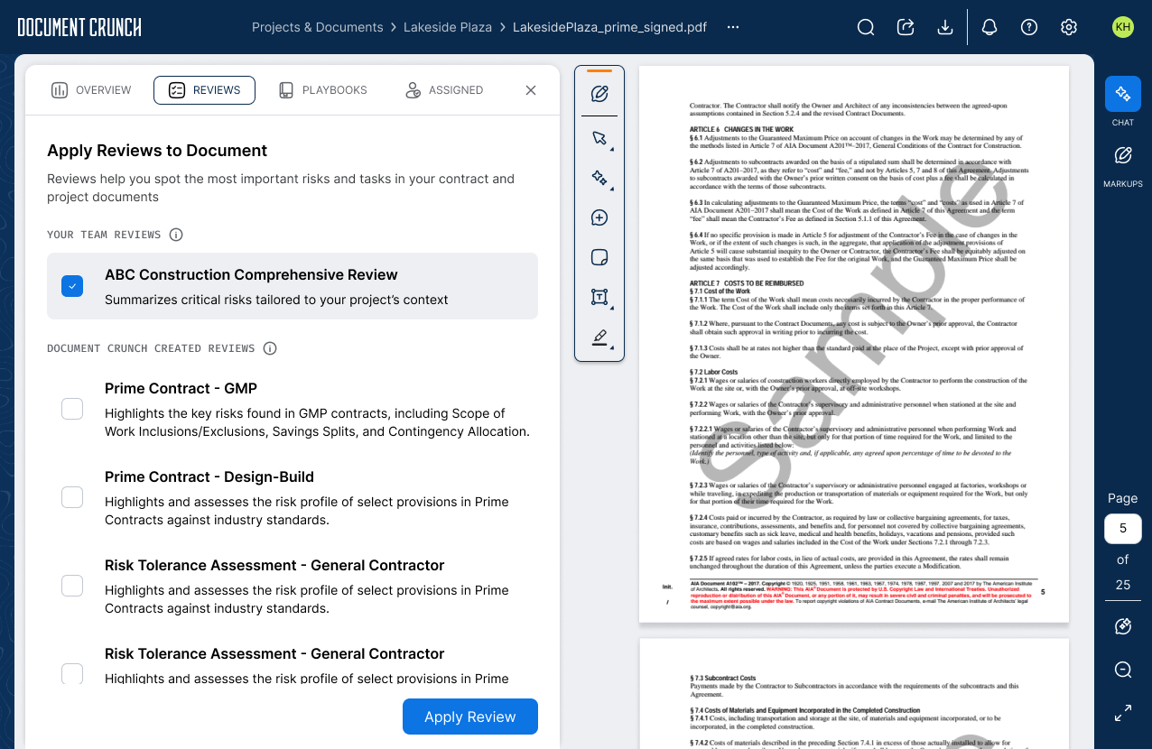
The first version of this feature — originally called Checklists, later renamed to Reviews — gave teams AI-powered contract analysis with a structured list of flagged items. The core idea was sound and customers liked it, but as Document Crunch's Review library expanded and organizations began building their own custom checklists, cracks started showing. Finding the right review for a specific document type meant scrolling through an ever-growing, unweighted list. Status questions were fixed and couldn't be tailored to how individual organizations tracked their work.
The 2.0 challenge was about scale: making Reviews useful not just for a single user doing a one-off review, but for organizations with specific workflows, growing review libraries, and diverse document types — without making the tool harder to use in the process.
The Process
Iterate
Deliver
Research
User Interviews
I interviewed legal ops managers, project risk leads, and contract administrators at general contractor firms — the people who owned the review workflow from start to finish. The goal was to understand where the 1.0 Review feature was falling short and what was keeping teams from using it at scale. What did their actual checklist setup process look like, and what would need to change for Reviews to become their primary contract review tool?
What emerged was less about the checklist itself and more about ownership and configuration. Teams wanted to build their own reviews, tailor status questions to their org's risk framework, and have the tool automatically surface the right checklist when they uploaded a specific document type — without having to scroll, search, or remember which template applied to what.
Key Signals from the Data
Alongside the interviews, FullStory analytics, CSM call themes, and feedback from the broader Document View opportunity brief surfaced the patterns that quantified what reviewers had been describing qualitatively.
of users use Reviews — but many can't find where to start from the home tab, and fewer than 20 users per week engage with Review filters. High adoption, weak discoverability.
items in our largest review — with no way to search within it, users were overwhelmed and abandoning reviews mid-way through.
of users engage with Playbooks, but the tool was treated nearly identically to Reviews despite having a distinct use case and workflow — making it harder for teams to know when to reach for which.
reviewers per document, typically — a first-pass reviewer flags items, then a second checks the work. The 1.0 view gave neither person clear visibility into which questions had been touched, what status had been assigned, or where the handoff should pick up.
Key Findings
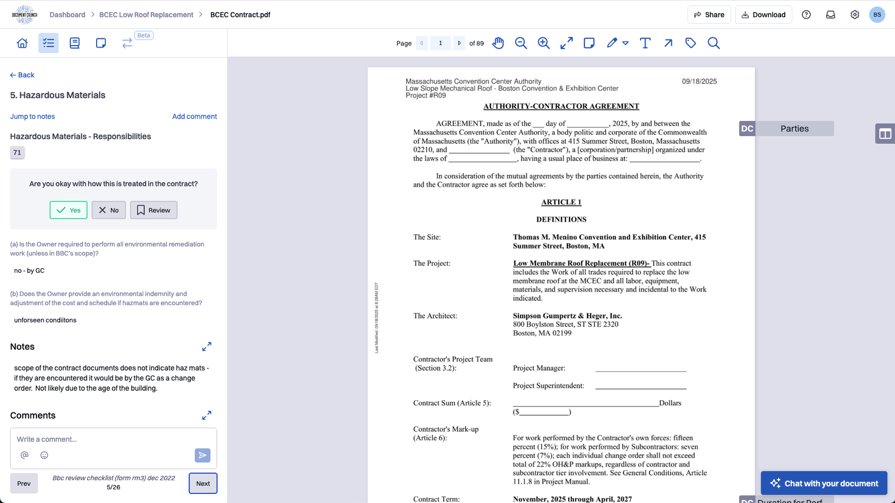
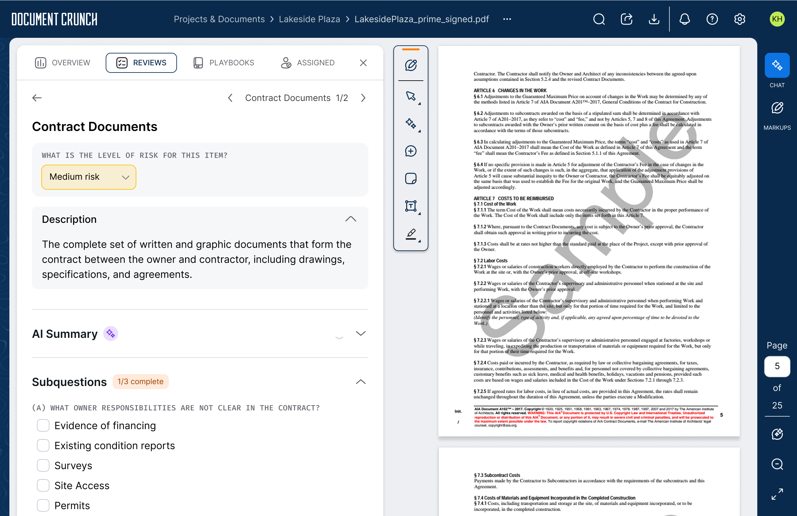
Status questions needed to be editable and removable. Every organization had a different risk tolerance and a different set of questions they needed answered — the fixed default options worked for pilots but failed at scale.
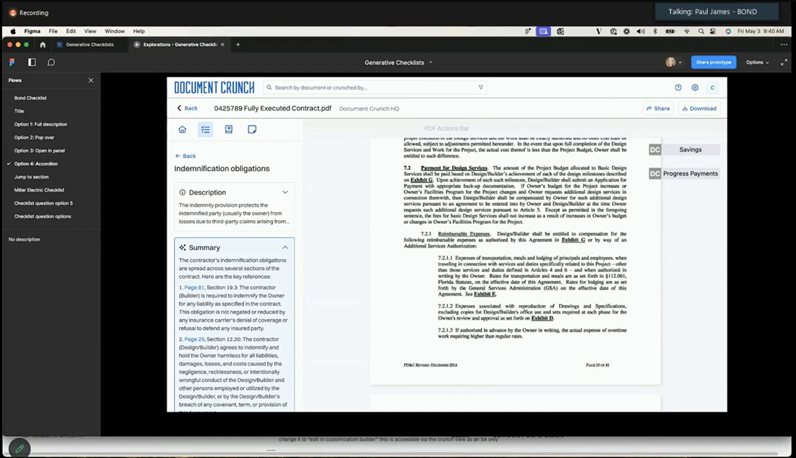
Trust in AI-generated content remained conditional: users would act on AI suggestions only if they could see exactly what triggered each one. Source citations linking items back to specific contract clauses were non-negotiable.
As the Review library grew, users couldn't efficiently find the right review for their document type. Scrolling through an unweighted list of 15+ options at upload added friction exactly when speed mattered most.
The distinction between Reviews and Playbooks wasn't legible to users. Teams were applying the wrong format for their workflow, and the UI gave them no way to understand the difference or switch between them.
Users wanted a dedicated overview of their review's progress — how many items had been reviewed, how many had a status applied — without having to scroll the full checklist to assess where they stood.
Design & Iterate
Wireframes & Iteration
The wireframes for 2.0 leaned heavily on what we'd already learned from testing the original Checklists feature. Customers had built real internal workflows around those checklists — whole review processes, handoffs, and reporting habits that were now part of how their teams operated. Reinventing the core interaction would have broken the muscle memory they'd developed, so the goal wasn't to redesign how a checklist worked. It was to make the existing experience faster to move through and easier to navigate at scale.
Most of the design work went into navigation and findability. We added filters so reviewers could jump to the subset of questions that applied to them, surfaced the status and metadata of each question inline so users could scan a checklist and immediately see where they needed to focus, and tightened up the question-to-question flow so moving down a long list felt continuous rather than effortful. None of these were dramatic UI changes — they were small reductions in friction that compounded across the hundreds of questions a single review might contain.
I also designed the question container to be extensible. Each question is structured as a flexible unit that can carry additional functionality over time — comments, tasks, linked documents, and other contextual actions — without requiring a fresh redesign every time a new capability lands. That foresight has already paid off as later releases have layered new functionality into the same container.
Before & After
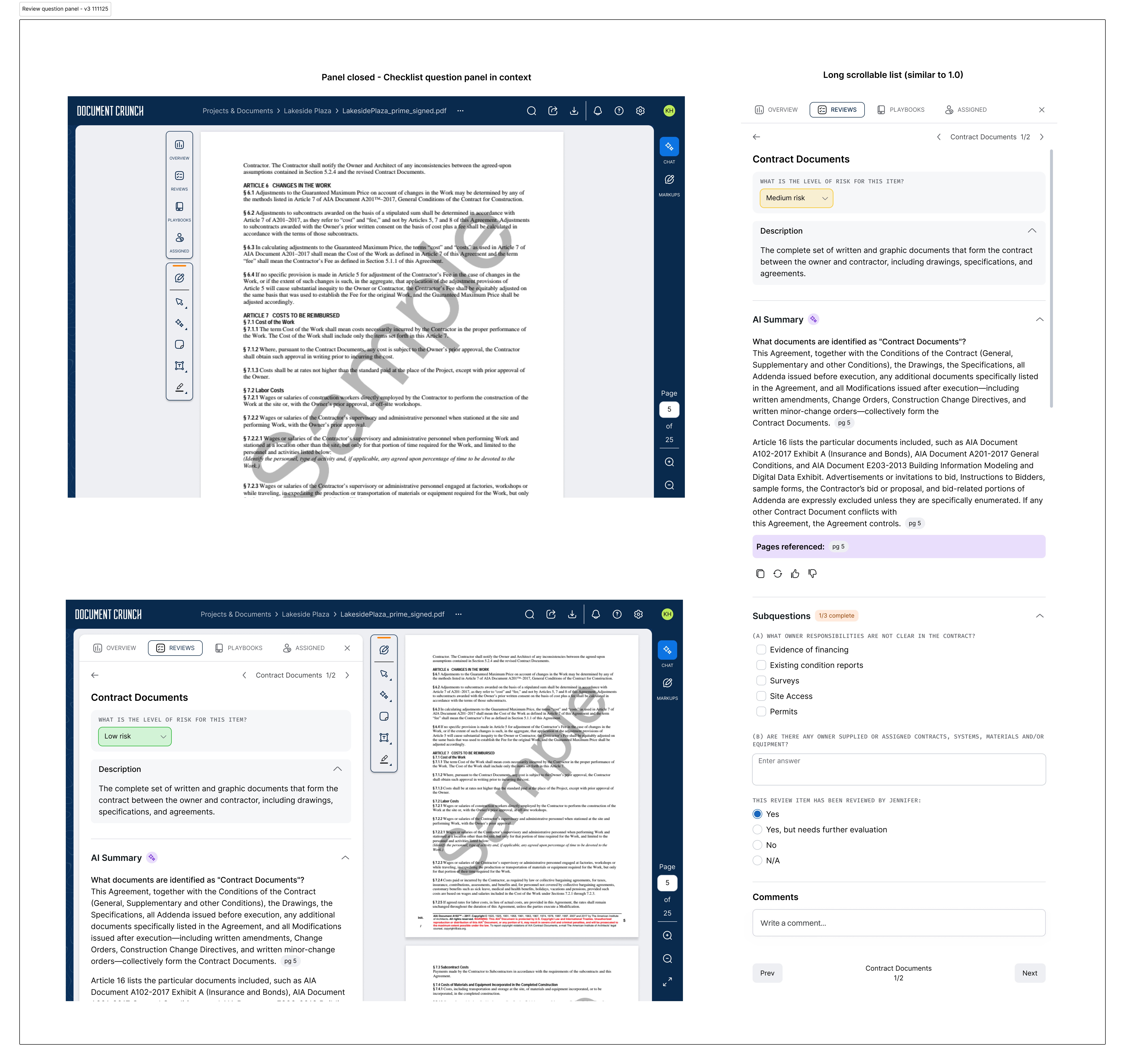
The 1.0 checklist had a small set of preset status options — teams could pick from Yes / No / Review or High / Medium / Low — but couldn't customize that section to match how they actually worked. On top of that, each item carried both a Notes field and a Comments thread that did roughly the same job, which created confusion about where to capture what. And the visual hierarchy didn't separate the question, the answer, and the supporting context cleanly enough — everything competed for the same level of attention.
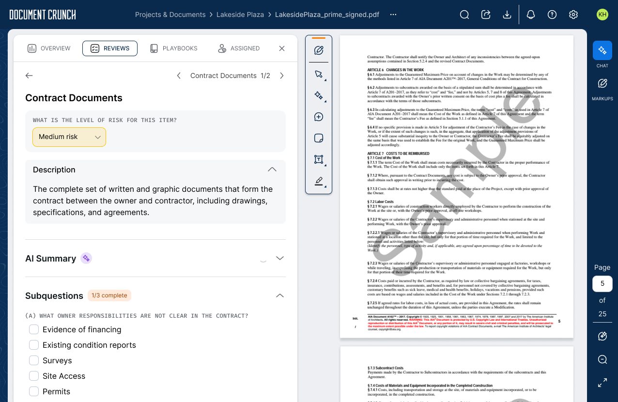
The 2.0 design let teams configure their own status questions per organization (any response type, any set of options), collapsed Notes and Comments into a single threaded discussion, and reworked the hierarchy so the question and its status sit at the top of each item, with description, AI summary, and subquestions stacking below in a clear reading order.
Develop & Deliver
The Final Design
Reviews 2.0 shipped three interconnected capabilities: editable status questions that let teams customize how they track review progress per item; a Review Builder for power users managing multiple configurations across their organization; and smarter review suggestions when users went to add additional reviews to a document — matching against the document type so the most relevant options surfaced first instead of forcing users to scroll an unweighted list. Together, these moved Reviews from a tool that individual users ran on individual documents to one that could be configured, shared, and scaled across an entire organization.
Editable & Removable Status Questions
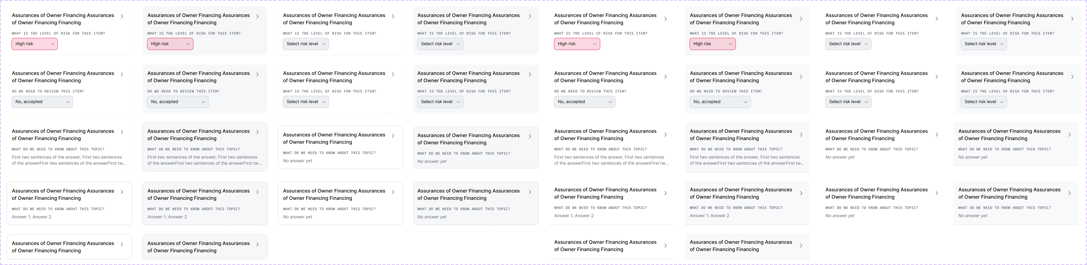
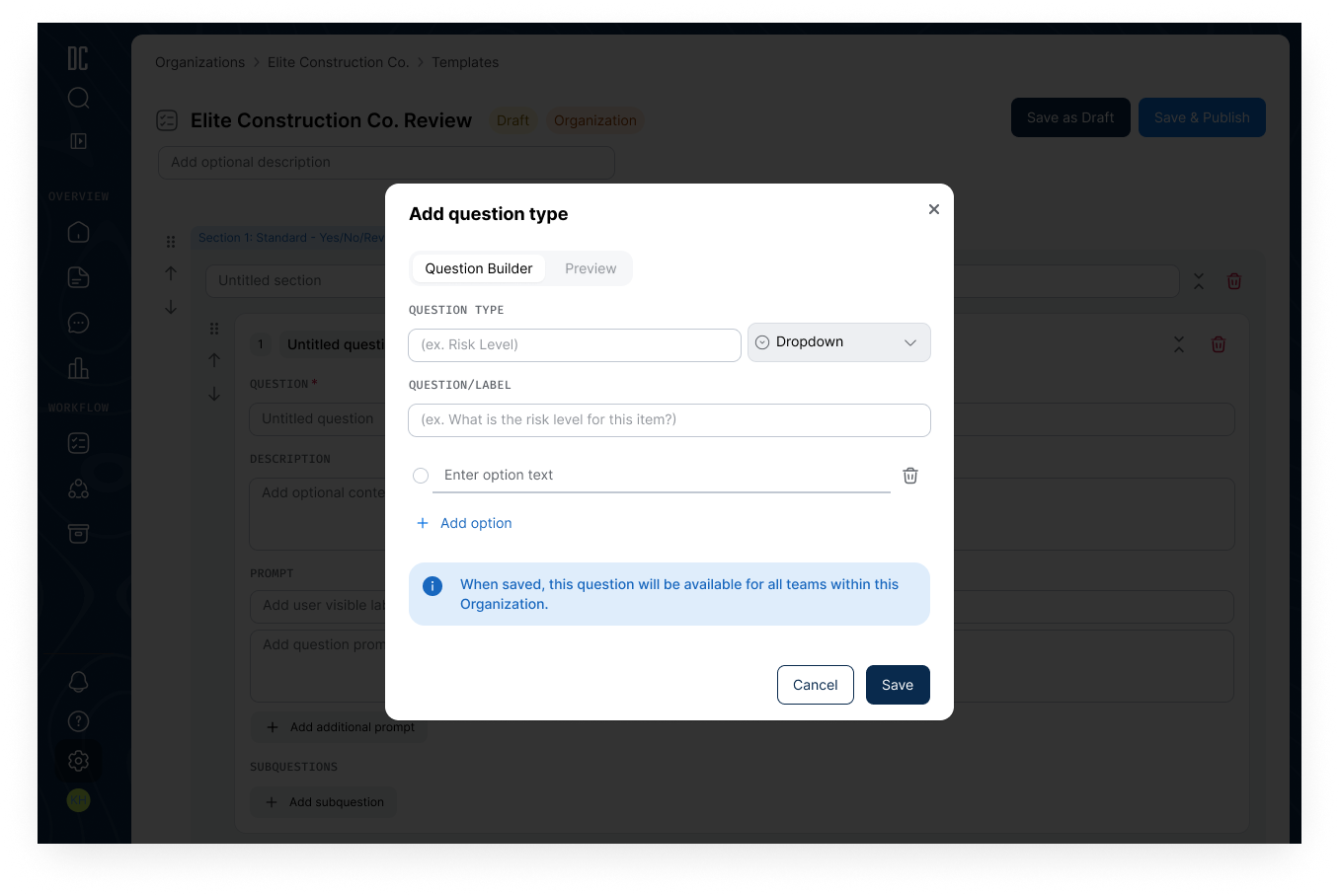
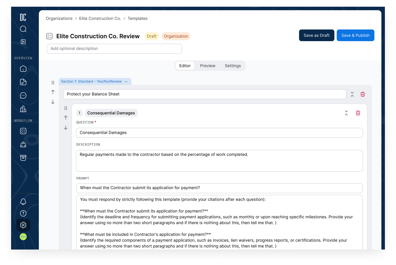
A status question is the prompt attached to each review item that captures the reviewer's judgment on that clause — the answer to "what did you find here?" In 2.0, every part of that question became customizable. Teams pick the question text, the response type (free-text input, radio buttons, multi-select, or yes/no), and the set of options that make sense for their org — a simple Yes / No / Needs Review for one team, a High / Medium / Low risk scale for another, or a fully bespoke set of choices for teams with their own compliance vocabulary. Teams can add, edit, reorder, or remove questions directly within the checklist, and changes persist across all future uses of that review — so a team that configures their status questions once doesn't have to touch them again. A dedicated overview tracks how many items have been reviewed and how many have a status applied, giving teams a live read on where the review stands without requiring a full scroll.
Review Builder
The Review Builder is a dedicated configuration interface for creating and managing reviews at the organizational level. Teams can import reviews from an existing configuration or export their current setup for sharing or backup. A Playbook/Review toggle lets teams convert between the two formats — with the UI surfacing the structural difference: Playbooks run sequentially and don't carry status questions; Reviews do. A "clear all prompts" option lets teams convert any AI-generated review into a fully manual checklist, preserving the question structure while removing AI dependencies for organizations that prefer human-only review workflows.
The Review Builder was designed and shipped after the core Reviews work, as a follow-on project that built directly on the patterns established here. The full story — including how it grew into a broader customization system for the platform — is covered in the Customization Builder case study.
Document Type Association
As Document Crunch's Review library expanded, finding the right review at upload became a scrolling problem. Document Type Association lets organizations map their custom and standard Reviews to specific contract types — Prime Contract, Subcontract, Specifications, RFP/RFQ/ITB, and more — so when a user uploads a document, the most relevant reviews surface at the top of the list automatically. DC's default reviews remain available to all document types within the document view itself; the associations apply specifically at upload to reduce setup time and eliminate the guesswork of matching the right template to the right contract.
Project Takeaways
A note on impact data: Reviews 2.0 is still rolling out across our customer base, so we don't yet have post-migration metrics to quantify how the new design compares to 1.0. The takeaways below reflect the design and build process; comparative data will be added once adoption matures.
The hardest design problem on this project was that Reviews had to serve two very different audiences with the same interface: admins building out org-level review configurations, and reviewers running those reviews on real documents day-to-day. Anything that made the admin experience more powerful risked making the everyday reviewer experience more cluttered, and vice versa. The customization story made that tension sharper — teams genuinely needed editable status questions, but most users would never customize anything and just needed the defaults to be right. The answer ended up being a two-track design: the Review Builder lived as its own dedicated surface for admins, while the reviewer-facing surface stayed largely the same as 1.0 with the new customization options tucked behind a quiet edit affordance. Both audiences got what they needed without bleeding into each other.
The unexpected lesson was that the highest-impact change in 2.0 wasn't anything we added — it was the Notes field we removed. Notes and Comments had coexisted in 1.0, doing roughly the same job, and users were quietly working around the duplication by picking one and ignoring the other. Killing Notes felt risky because no one was explicitly complaining about it, but once it was gone the confusion it was creating became obvious in retrospect. It was a good reminder that "this is a feature people use" isn't the same as "this feature is helping people," and that removing the right thing can do more for a product than adding three new ones.