Company Details

Document Crunch is an AI-powered contract review platform built for the construction industry. It helps general contractors, subcontractors, and owners identify risk in contracts and project documents quickly and accurately.
The platform helps legal, risk, and operations teams review contracts at scale — surfacing critical clauses, obligations, and red flags so teams can make faster, more confident decisions.
As a product designer, I worked across the full product lifecycle — from discovery and user research through design, front-end development, and QA — to ship features that directly impacted how users engage with contract documents.
The Team
- 1 Product Designer
- 1 Product Manager
- 3–4 Engineers
My Role
UI/UX Design, User Research, Prototyping, QA, Cross-functional Collaboration
The Challenge
The 1.0 Document View had markup tools, but the way they were surfaced created real friction. Several of the tools lived behind an inline toolbar that users often didn't realize was there — valuable features like Explain were effectively hidden. The toolbar itself sat above the document and pushed page content downward whenever it was active, eating into the reading space even for users who weren't annotating in that session. And per Fullstory and usage analytics, a few tools were getting almost no real use, taking up visual real estate that better-performing tools needed.
The 2.0 rebuild was a chance to fix all of this at once: surface what was hidden, demote what was rarely used, and design a toolbar that respected the reading experience first. It was also a chance to lay groundwork for things the team knew were coming — richer document types like drawings (which need a movable toolbar), and a unified comment system that would eventually replace sticky notes — even when those features weren't shipping in this cycle.
The Process
Iterate
Deliver
Research
User Feedback from 1.0
The 1.0 markup experience had been in production for three years by the time this rebuild started, so there was a deep backlog of feedback to draw from — both from my own years of working on the surface and from CS and sales reporting recurring pain points they kept hearing on calls. Because markup was such a central part of the document view, the usability study for this work was combined with the broader document view study rather than run as a separate research effort.
The other consistent piece of feedback was about flow. Several reviewers mentioned that the toolbar's presence above the document — pushing the document downward whenever it was open — broke their reading rhythm even on sessions where they didn't add a single markup. A pure reading mode and a pure annotation mode weren't different enough to feel like different modes, but they were different enough that the toolbar's footprint mattered.
Usage Data & Session Replay
To complement the interviews, I pulled usage analytics and watched Fullstory sessions to see what users were actually doing rather than what they thought they were doing. The data was clear: a handful of tools accounted for the vast majority of markup interactions, while a few others were getting almost no use at all. Explain, in particular, was being clicked far less than its actual usefulness justified — not because users disliked it, but because it was buried behind another menu and most people never found it.
That gap between perceived utility and actual surfacing became the framing for the redesign. The new toolbar wouldn't just be cleaner — it would actively re-weight the tools based on what users got value from, giving more space and visual emphasis to features like Explain while quietly de-emphasizing tools that data showed weren't pulling their weight.
Design & Iterate
Wireframes & Interaction Design
The first wireframes worked through every state of the new toolbar — default, hover, selected, expanded sub-menus, and the inline tooltips that label each tool. The goal was to make every tool visible and accessible without requiring a hidden menu, while still respecting the limited horizontal space the toolbar could occupy. Each tool went through a usage check before earning its slot.
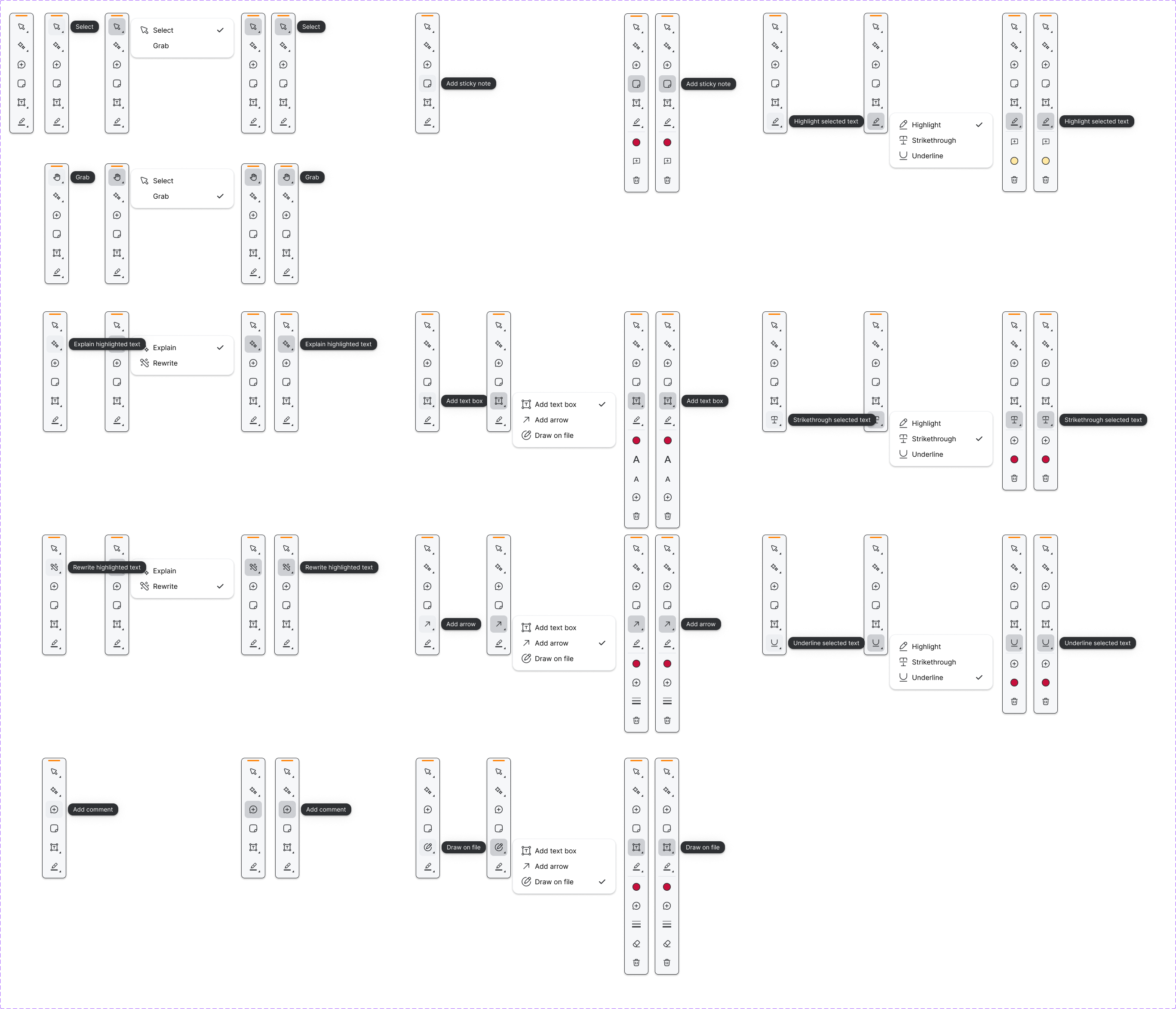
A second track of wireframes worked through the comment system. Even though the full unified-comments feature wouldn't ship in this cycle — another team picked it up later — I wanted to design the framework so that comments could eventually attach to any annotation type (highlights, underlines, strikethroughs, arrows, added text), not just exist as standalone sticky notes. Designing the comment states up front meant the team picking it up later had a clear pattern to build against, and it gave the current design a clean place to land for the lighter version we did ship.
A related thread was about giving users more control over the toolbar itself, especially for document types like drawings where the toolbar can easily cover the part of the plan you're trying to read. We ended up shipping a movable toolbar so reviewers could drag it out of the way, but the dismissable version — where users could close it entirely — got scoped out of this cycle. The pattern is documented and waiting for drawings work to pick it back up.
Before & After
The 1.0 toolbar sat above the document, pushed page content down, and hid several tools (including Explain) behind a secondary menu. The 2.0 toolbar moved to a vertical right rail that's always visible without consuming reading space, surfaces every available tool at a glance, and uses visual weight to elevate the features users actually got the most value from.

Develop & Deliver
The Final Design
Markup Tools 2.0 introduced a vertical right-rail toolbar that's always visible, surfaces every tool without nested menus, and respects the reading experience by never pushing document content out of the way. Tool placement and visual weight were driven by actual usage data — Explain moved from buried to prominent, and a couple of low-usage tools were quietly retired so the toolbar could focus on what reviewers actually used. The redesign also shipped a movable toolbar so reviewers could drag it out of the way on drawing-heavy documents (the dismissable companion piece was scoped out of this cycle), and laid the groundwork for a unified comment system designed to eventually replace standalone sticky notes.
Always-Visible Right-Rail Toolbar
The biggest change in 2.0 is also the most invisible one: the toolbar no longer eats reading space. By moving from a horizontal bar that pushed page content downward to a vertical right rail anchored at the document edge, the toolbar gets full visibility for annotation-heavy sessions while staying entirely out of the way for read-only ones. Every tool is surfaced by default with a labeled tooltip on hover — no expand-to-reveal, no hidden submenus. The features that needed promotion (Explain, comments) got distinct visual treatment; the rarely-used 1.0 tools were either retired or repositioned to lower-emphasis slots based on the usage data.
Surfacing Explain
The 1.0 data showed Explain was being used a fraction of what its value warranted — because users couldn't find it. In 2.0, Explain got a top-tier slot in the new toolbar and a redesigned entry point on text selection, so reviewers could trigger an AI explanation of any clause without having to remember which menu it lived in. The response renders next to the selected text in an anchored panel, keeping the reviewer's eye in the document. The redesign reframed Explain from a buried utility to one of the visible centerpieces of the markup experience.
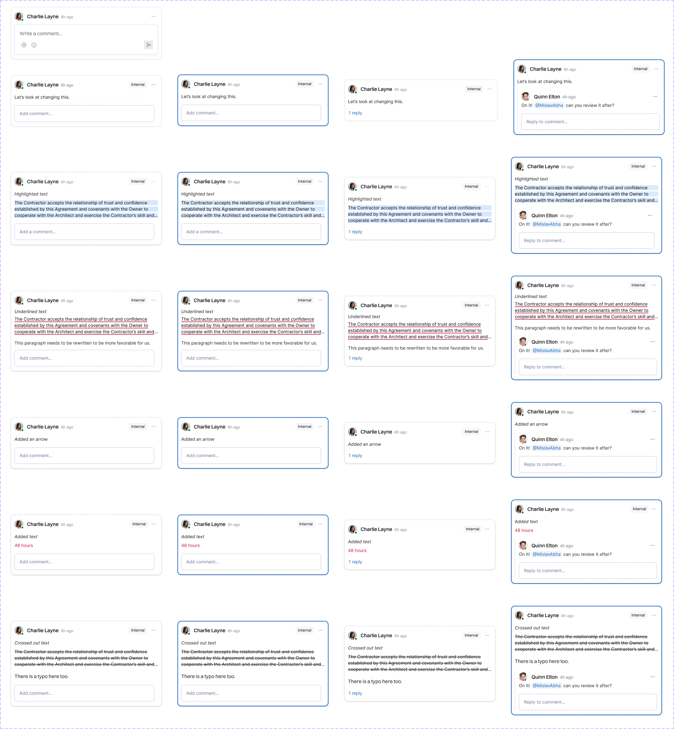
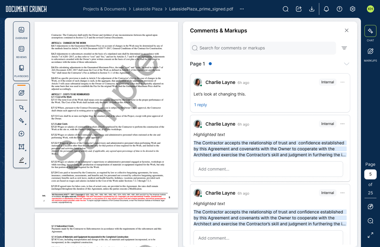
Annotation-Anchored Comments
Comments in 1.0 lived as standalone sticky notes, separate from any other annotation. In 2.0 we designed a unified comment framework: any annotation type — highlight, underline, strikethrough, arrow, added text — could carry a comment thread, replies, and reviewer attribution. The full implementation was picked up by another team in a later cycle, but the framework, comment states, and interaction patterns were designed and handed off as part of this project so the eventual rollout could move directly from spec to build without restarting the design conversation.
Project Takeaways
A note on impact data: Markup Tools 2.0 is still rolling out across our customer base, so we don't yet have post-migration metrics to quantify how the new design compares to 1.0. The takeaways below reflect the design and build process; comparative data will be added once adoption matures.
The biggest lesson from this project was how much weight Fullstory and usage data deserve in design decisions. The 1.0 markup tools weren't broken in the abstract — they were broken because reviewers couldn't find half of them. Once we layered actual session data over user feedback, the redesign priorities reordered themselves: surface what's hidden, retire what's not used, and stop assuming that "we shipped it" is the same as "users can use it." The toolbar redesign was almost a side effect of getting that prioritization right.
The other lesson was about designing past the current cycle. Two of the most important pieces of this work — the movable toolbar and the unified comment framework — didn't ship in 2.0. The movable toolbar was cut for scope; the comment system was handed to another team. Designing both anyway meant that when drawings work eventually picks up the movable toolbar, or when the comment team starts building, neither team has to start from scratch. Carrying a design forward even when it's not going into this cycle's release notes is one of the higher-leverage things a designer can do on a roadmap that moves faster than any single team can ship.