Company Details

Document Crunch is an AI-powered contract review platform built for the construction industry. It helps general contractors, subcontractors, and owners identify risk in contracts and project documents quickly and accurately.
The platform helps legal, risk, and operations teams review contracts at scale — surfacing critical clauses, obligations, and red flags so teams can make faster, more confident decisions.
The Team
- 1 Product Designer (me)
- 1 Product Manager
- 3–4 Engineers
My Role
Lead UX Design, User Research, Usability Testing, Prototyping (Figma), Design QA, Cross-functional Collaboration
Timeline
August – September 2025
The Challenge
The original Document View workspace had grown cluttered and complex over time. As Document Crunch added powerful features incrementally — provisions, Checklists/Reviews, playbooks, markup tools, chat, and notes — the document review experience became overwhelming. Users couldn't tell where to start. Key features appeared in multiple places. And the intersection of tools created friction instead of flow.
The core tension: the platform was intentionally flexible, letting users develop their own workflows — but that flexibility came at the cost of clarity. Users weren't discovering features, weren't completing checklist reviews, and were losing confidence at exactly the moment they needed to move quickly through a high-stakes contract.
The Process
Iterate
Deliver
Research
Product Discovery & Signals
The product manager led a deep product discovery effort to document the opportunity for a full Document View redesign. The opportunity brief synthesized FullStory data, CSM call themes, customer feedback, and internal team observations to build a shared picture of where the experience was breaking down.
The document identified seven distinct problems — from unclear starting points and duplicate feature locations to inefficient use of space and inconsistent interaction models across the platform's core tools. These weren't minor UX rough edges; they were systemic issues rooted in a product that had grown without a cohesive end-state vision.
Existing Experience Audit
The legacy Document View had been built feature-by-feature over several years, resulting in a workspace where Provisions appeared in both side panels, markup tools lived in three different places, and there was no clear visual hierarchy to guide users through a review.
For users who weren't power users, the interface was especially punishing — too many unlabeled icons, unclear entry points, and a layout that required knowing where things were hidden before you could use them. The platform was functional, but it wasn't discoverable.

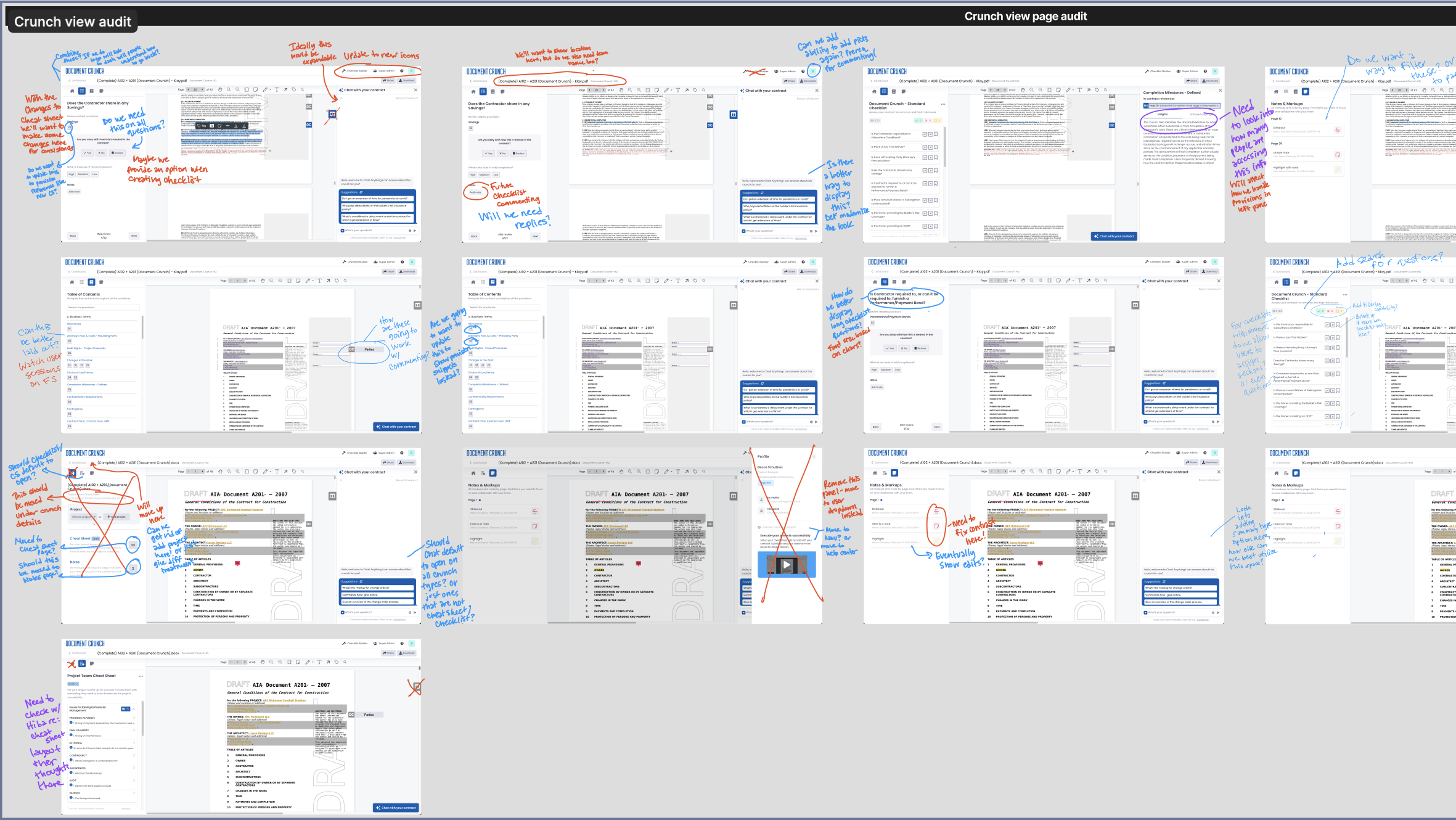
Tool Audit & Consolidation
Before any redesign work began, I did a page-by-page audit of the existing Document View — mapping every tool, panel, and entry point across the surface, noting where features were duplicated, where primary actions were buried, and where the layout was working against discoverability. The audit screenshots below capture that walkthrough, with annotations flagging redundancies (Provisions in two places, three markup tool entry points), inconsistent interaction patterns, and key features like Explain that were effectively hidden.
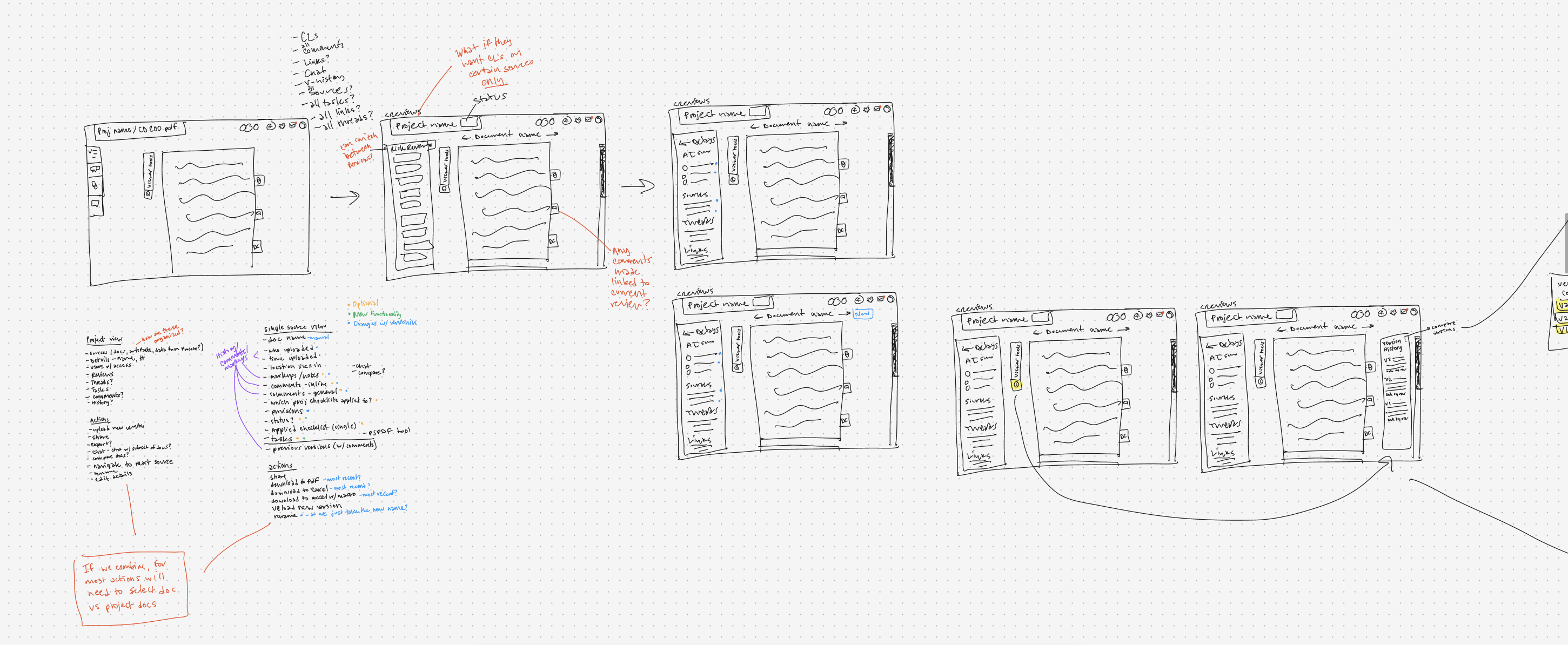
From the audit, I moved straight into low-fidelity sketches to explore new layouts — testing different ways of grouping related tools, deciding what should be persistent versus on-demand, and figuring out which features deserved primary positioning versus which could be tucked away without hurting their findability. The sketches let me iterate fast on the structural decisions before committing to any high-fidelity work.
Usability Testing
The Testing Plan
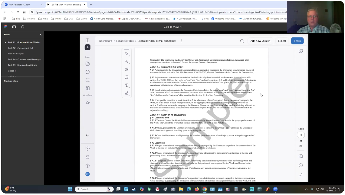
I designed and led a formal usability study around the early 2.0 File View concepts in Figma. The goal was to test our hypotheses about the redesign before committing to full development — specifically whether the new layout helped users navigate more easily, locate tools faster, and experience fewer points of confusion compared to the current version.
The study ran August 25 – September 8, 2025, with 8 participants across two channels: 4 internal legal reviewers and project managers via moderated Zoom calls, and 4 external construction industry users via UserTesting.com. Each session ran approximately 50 minutes.
Task Structure
Sessions were structured around five core task areas, moving participants from first impressions through real-world review workflows:
First Impressions — Open the prototype. Describe what you see. What stands out? What features or buttons do you notice first?
Basic Navigation — Navigate through the page: open and collapse the left sidebar, navigate to the folder, click into a document, zoom in and out.
Search & Discovery — Search for the word "negligence" in the document. Navigate to where it appears using the search box and available tools.
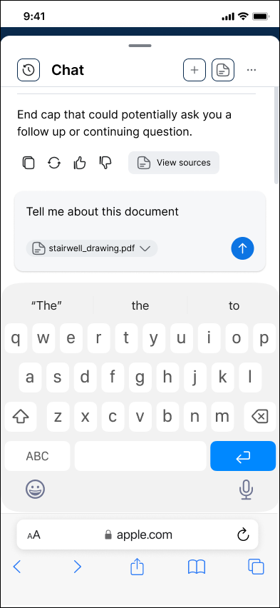
Comments & Markups — Click to add a comment to your document. Navigate to the File Chat feature and search for information about Design Responsibility.
Download & Share — Try to download the file. Now attempt to share the file with a colleague.
Wrap-Up — What was the easiest task? The hardest? What would you improve about this viewer?
A/B Panel Layout Comparison
In addition to the core task flow, I ran a structured A/B comparison of two panel layout variations. Participants completed a short, identical task in each version — then shared their preference and reasoning.
The comparison focused on how users interacted with the File Chat panel, the checklist and provision layout, and how quickly they could locate items without prompting. Their feedback directly shaped which layout direction we moved forward with.
Design & Iterate
Prototyping in Figma
I built interactive prototypes in Figma for both the 1.0 legacy view and the 2.0 redesign, giving usability testing participants a realistic experience to react to. The prototypes covered the full document review workflow — from navigating the sidebar and searching within a document to adding markups, commenting, and sharing.
Having both versions as working prototypes made the A/B comparison concrete rather than hypothetical, and allowed participants to give feedback rooted in actual interaction rather than opinion.
Before & After
The redesign consolidated duplicate panels, established a clear visual hierarchy, and moved from a tool-first layout to a workflow-first layout — guiding users through a document review rather than leaving them to discover the path on their own.
Develop & Deliver
The Final Design
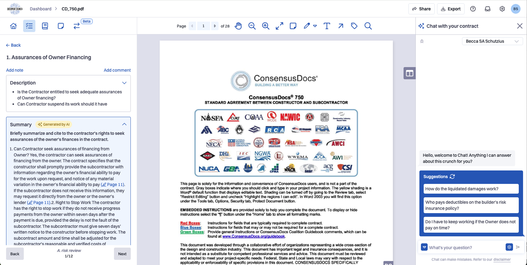
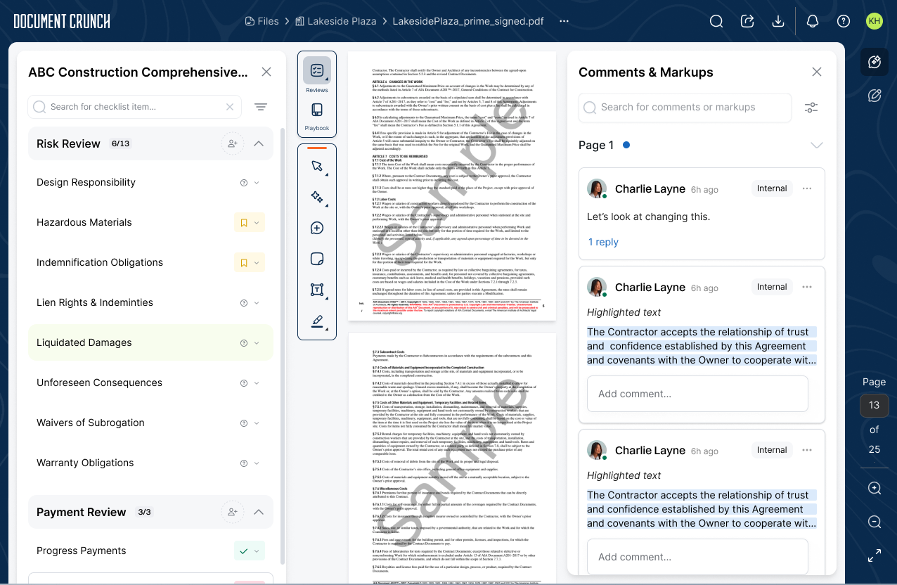
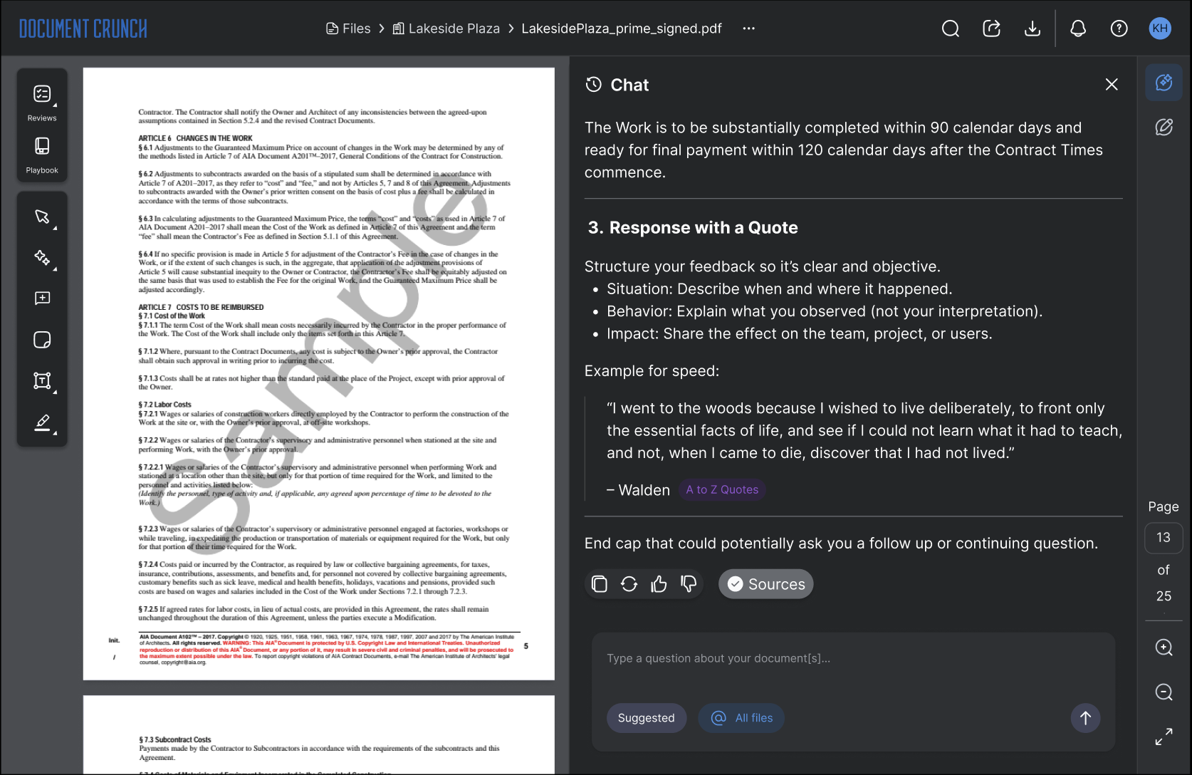
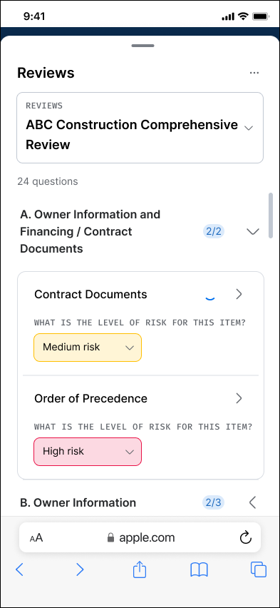
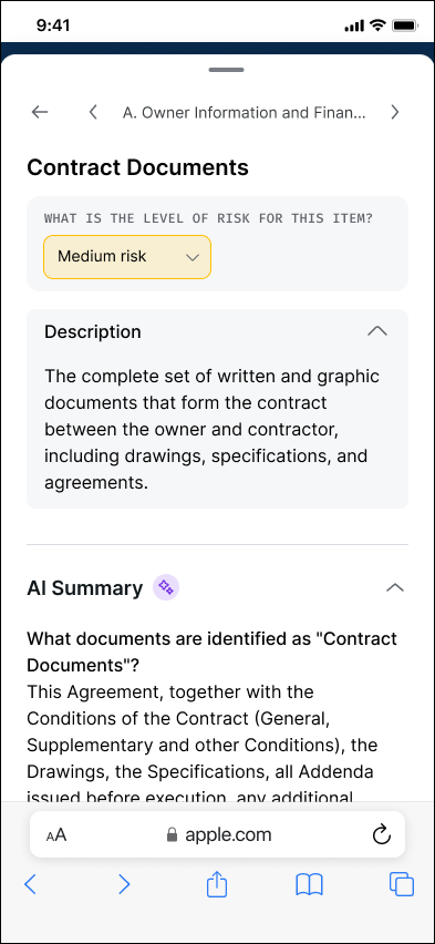
The 2.0 Document View is a cohesive, workflow-oriented workspace that consolidates Provisions, Checklists, and Playbooks into a unified review experience — designed around how legal and risk reviewers actually move through a contract, from first pass to handoff to final export. As part of the rebuild we also renamed the feature: Checklists became Reviews in the new platform, language that better reflects how legal and risk personas talk about the work. Reviews are built on generative checklists that legal/risk admins configure in the Customization Builder — each question carries an optional prompt, description, subquestions, and an overall status whose values are themselves customizable (Yes/No/Review, Yes/No/N/A, High/Medium/Low, and so on). The redesign extends beyond the desktop: a touch-first mobile experience brings the same workflow to the jobsite, so reviewers can pick up a review on a phone exactly where they left off at their desk.

Dark Mode
Reviewing dense contract language for hours at a time is hard on the eyes — especially in low-light offices, evening jobsite reviews, or on a laptop screen in a truck cab. Dark Mode preserves the full Document View workflow with a calibrated dark palette: high-contrast document text on a softened paper background, dark navigation chrome that recedes from focus, and a Chat panel that keeps AI responses, citations, and structured suggestions easy to scan. Every accent color — risk indicators, AI badges, source highlights — was re-toned for dark mode rather than algorithmically inverted, so meaning carries through without visual noise.
Mobile View
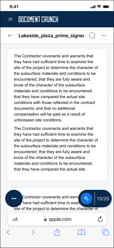
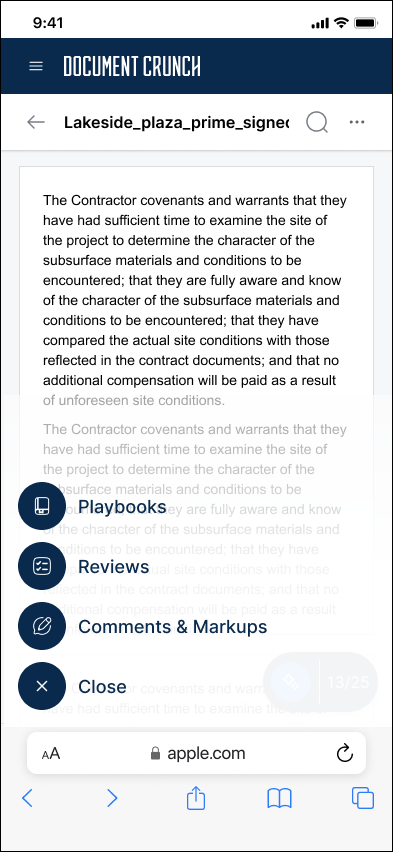
Construction professionals don't review contracts at a desk — they review them in trucks, on jobsites, and between meetings. The Document View 2.0 had to feel native on a phone, not like a desktop tool squeezed onto a smaller screen. The mobile experience reorganizes the same workflow around touch-first interactions: a dark navigation chrome that stays out of the way of the document content, a single floating action button that opens contextual tools (Playbooks, Reviews, Comments & Markups) on demand, and full-screen panels for Chat, Reviews, and item detail so each task gets its own focused surface. Per-question status (whichever values the admin configured in the Customization Builder), AI summaries, and section-level completion counts all carry over from the desktop experience — styled and re-laid-out for one-handed use, but functionally identical so a first-pass reviewer can flag items in the field and a second reviewer can pick up the check on a desktop without losing context.
Project Takeaways
A note on impact data: Document View 2.0 is still rolling out across our customer base, so we don't yet have post-migration metrics to quantify how the new design compares to 1.0. The takeaways below reflect the design and build process; comparative data will be added once adoption matures.
This project reinforced something I think about often: when a product is built feature-by-feature without a cohesive end-state vision, the accumulated cost shows up in user confidence, not just usability metrics. Users weren't failing to use Document Crunch — they were succeeding despite it. The opportunity brief helped the team see that clearly, and the usability study gave us a fast, structured way to validate our redesign direction before a single line of production code was written.
Running both moderated Zoom sessions and unmoderated UserTesting.com sessions in parallel was particularly valuable. The moderated sessions surfaced the "why" behind confusion; the unmoderated sessions showed us what users did when no one was watching. Together they gave us a richer, more honest signal than either method would have alone.