Company Details
Nextpoint is a litigation software built with Ruby on Rails, JavaScript, HTML and CSS. It is used by attorneys, paralegals, and litigation specialists that handle the full litigation cycle.
There are parts of the app used to collect data, review data, and produce data.
As a product designer, my role was to oversee the full cycle of every feature I was involved with from research to deployment. I was also in charge of testing my own features and managing the projects as well. I was heavily involved in the code, specifically front end, and QA before deploying to production. I was also in charge of graphics, icons, and graphics for email campaigns and release notes.
The Team
- 1 Product Designer / Front End Developer
- 2 Full Stack Developers
My Role
UI/UX (HTML, CSS, JavaScript, Ruby on Rails, Chart.js), Testing, Project Management, Marketing & Client Support
The Challenge
Help users understand collected/imported data and cull down what needs to be reviewed and coded for production.
In the past, the system only allowed users to collect their data, then they would have to dig through and search for their data in order to organize it and produce it. We wanted to create a dashboard to help easily identify the types of data within the database and give the user a place to better understand what needs to be reviewed and produced.
The Process
Iterate
Deliver
Research
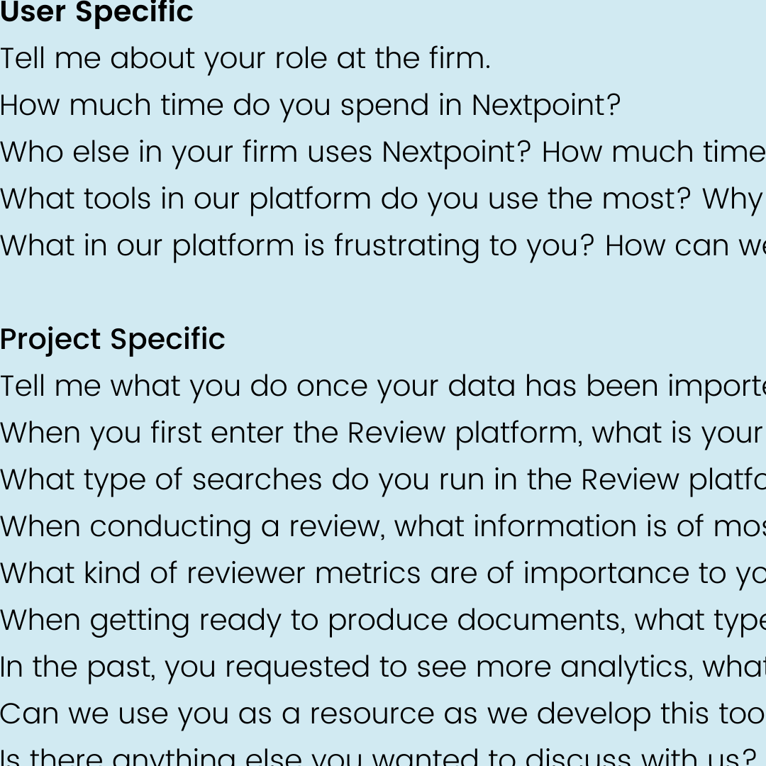
User Interviews
The first step of the research process was to get client feedback. We gathered information from client success/sales calls and JIRA. We then invited 6-7 power users for interviews conducted over Zoom and phone calls.
The goal was to understand how users currently interacted with their data, what information was most critical during the litigation process, and where they experienced the most friction.
Key questions focused on their search behaviors, how they identified relevant documents, and what kind of high-level data overview would help them work more efficiently.
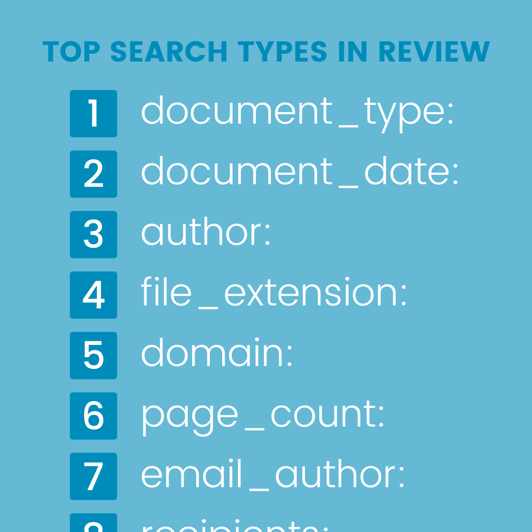
Review Analytics
We analyzed Google Analytics data from the Review section of the application to understand what types of searches were most common. This quantitative data, combined with qualitative user feedback, informed which data groupings to include and how to display them on the dashboard.
The analytics helped us identify the top search types and most-used filters, giving us a data-driven foundation for the dashboard's information architecture.
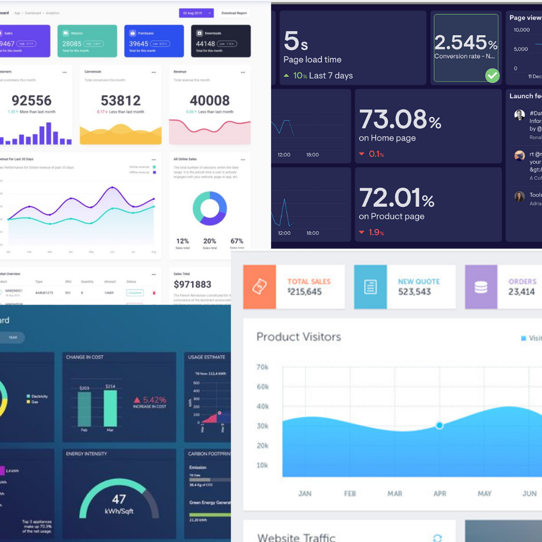
Mood Boards
I looked at a variety of dashboard designs and data visualization patterns to establish a visual direction. I explored different chart types, color palettes, and layout approaches that would work well for presenting litigation data in a clear and actionable way.
The mood boards helped align the team on the aesthetic direction before moving into wireframes, ensuring we had a shared vision for the dashboard's look and feel.
Ideate & Iterate
Low Fidelity Wireframes
I started with low-fidelity wireframes in Balsamiq to rapidly explore different layout options. The focus was on how to organize the data groupings and what the overall information hierarchy should look like.
Multiple layout variations were explored, including different placements for the data overview, customizable widgets, and review tracking charts.
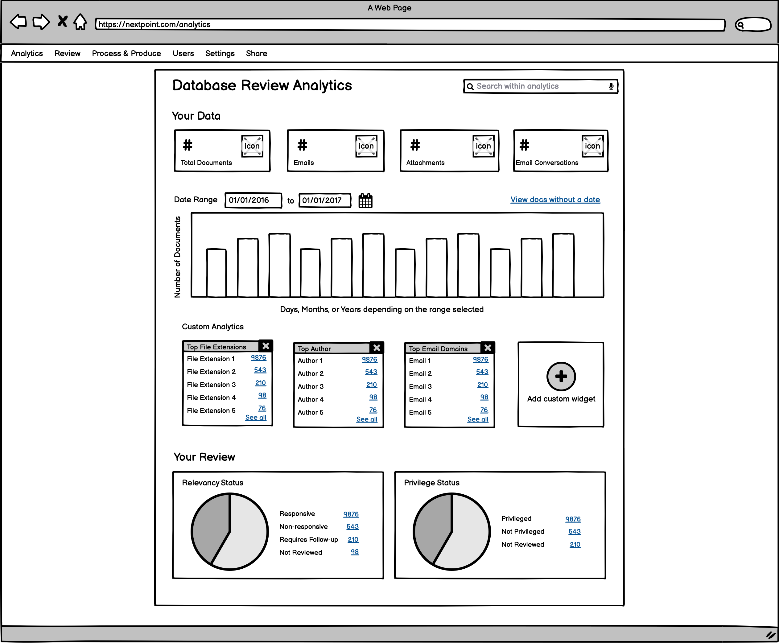
High Fidelity Wireframes
After aligning on the layout direction, I moved into high-fidelity wireframes in Figma. These incorporated the actual color palette, typography, and Chart.js visualization styles that would be used in the final product. We reviewed these with stakeholders and iterated based on their feedback before moving into development.
Develop & Deliver
Front End Development
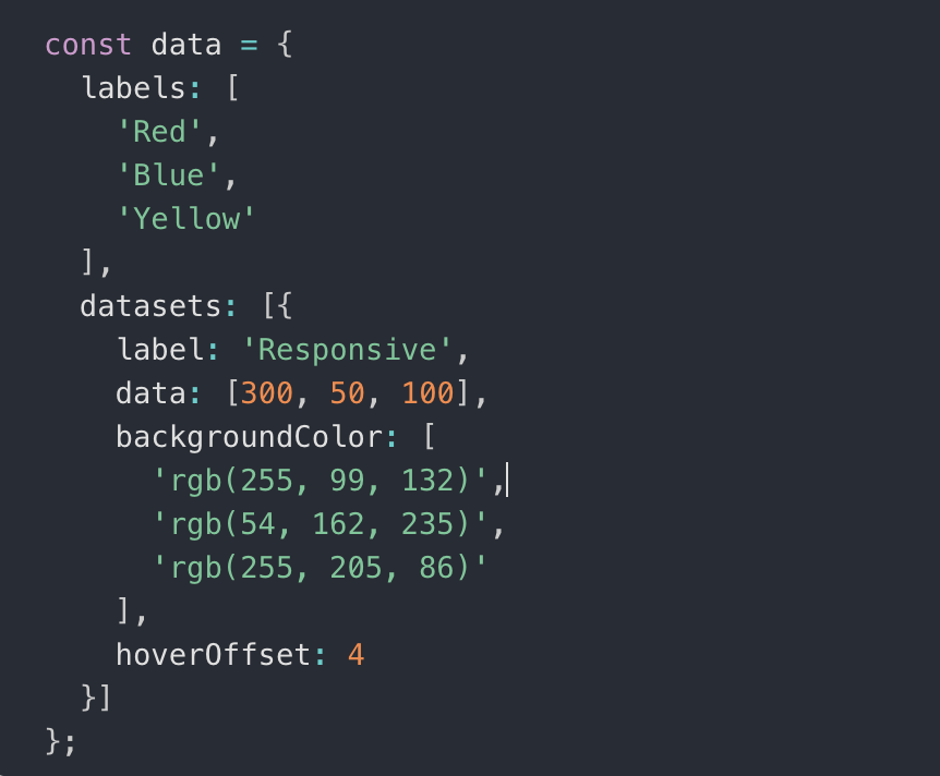
Working closely with two full-stack developers, I built the front end using HTML, CSS, JavaScript, and Ruby on Rails. Charts and data visualizations were implemented with Chart.js for interactive, responsive graphics.
The project was built over two months in agile sprints. Since there was no dedicated QA team, we handled our own testing across all major browsers and on tablets to ensure a consistent and reliable experience across all the ways users might access the dashboard.
The Final Features
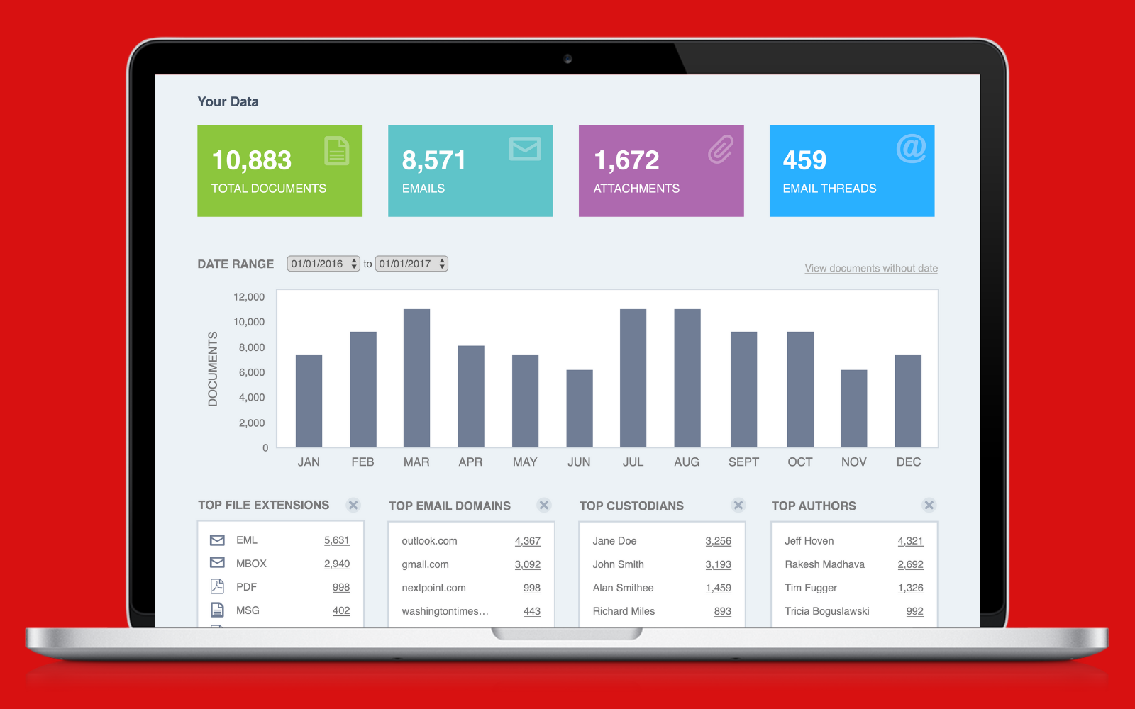
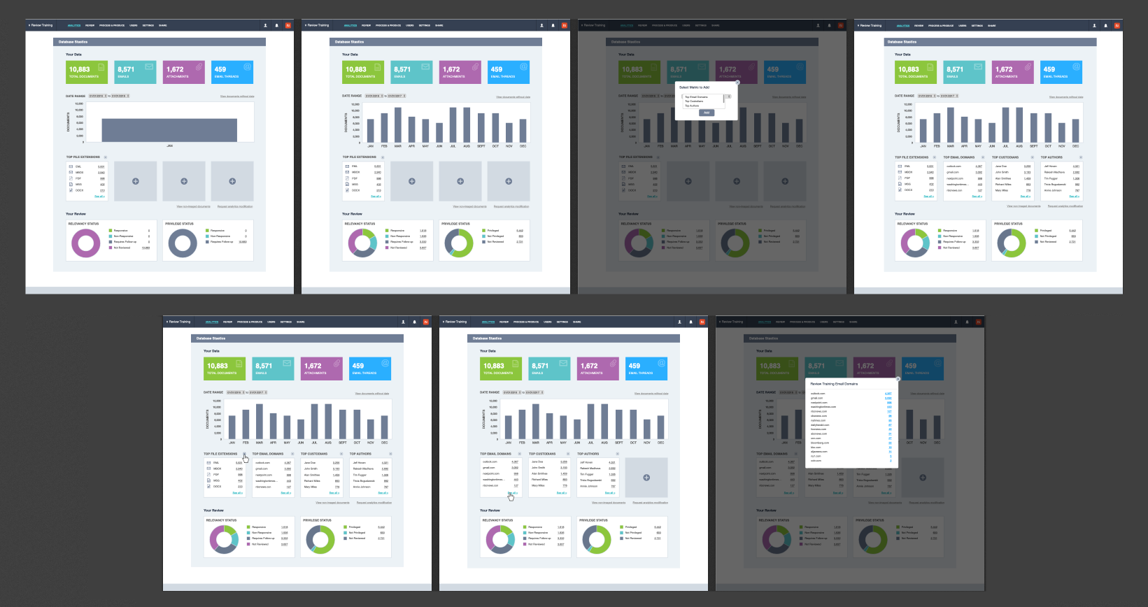
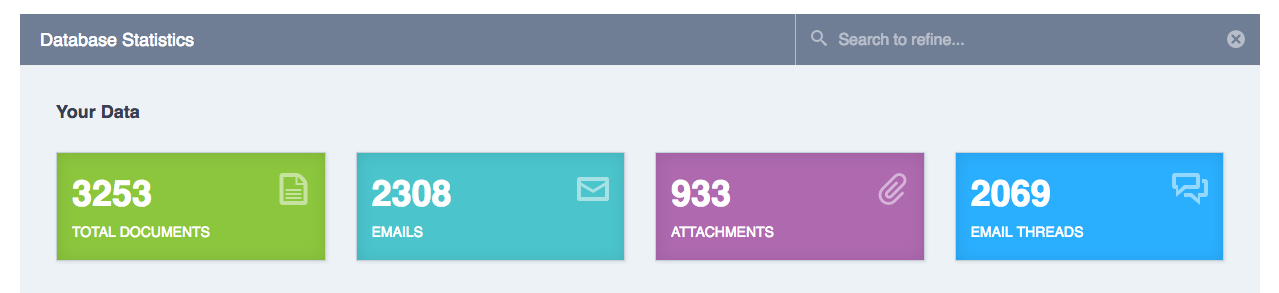
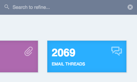
Top Data
The top section provides a high-level data overview showing total documents, emails, attachments, and email threads. These counts give users an immediate snapshot of the volume and composition of their database before diving into specifics.
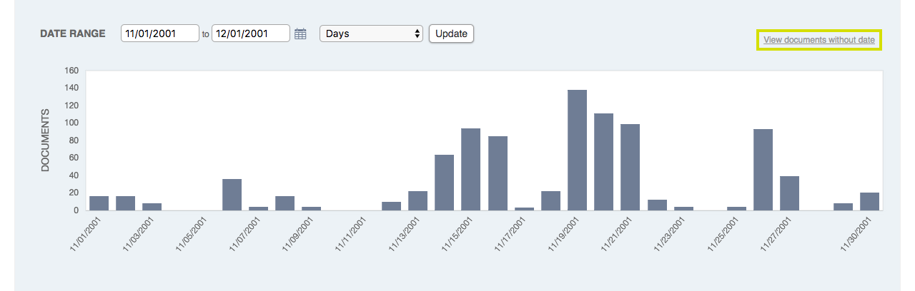
Guaranteed Quick Chart
The guaranteed quick chart displays the data that our analytics told us were the most searched types of data. This always-visible section ensures users can immediately see the most relevant information without any configuration needed. The data is presented in bar chart format for easy comparison.
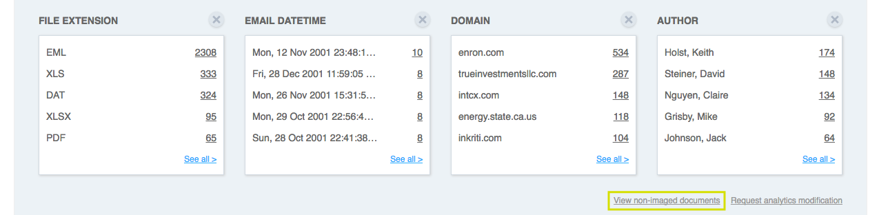
Custom Widgets
Users can select up to 4 data groupings from available options. Each widget shows a clickable top-5 list that links directly to filtered search results. This personalization allows every user to configure the dashboard to show exactly the data that matters most to their workflow. If they want to see different data, they can easily swap widgets.
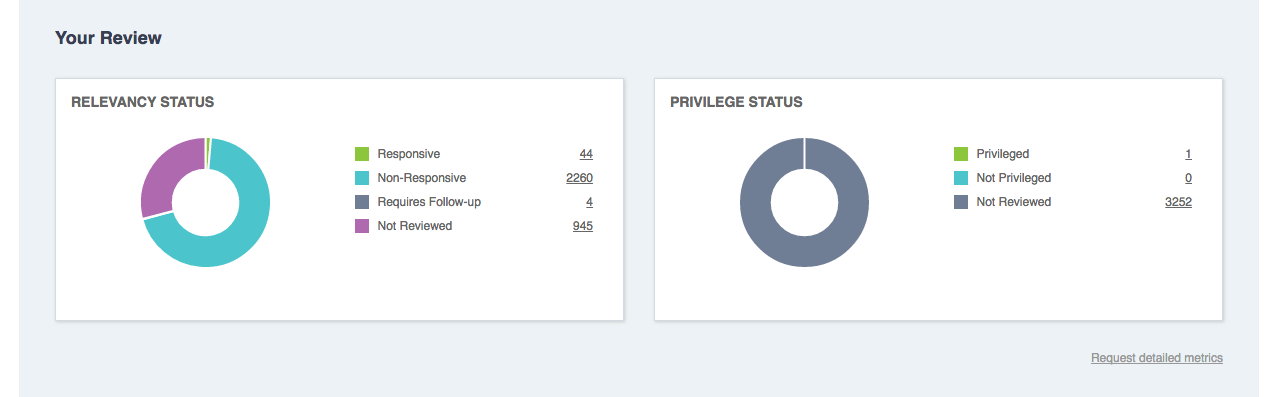
Your Review
Doughnut charts for relevancy and privilege coding status give reviewers a quick visual snapshot of review progress. The charts update in real time as documents are coded, providing a constant pulse on how much work remains and the breakdown of coding decisions.
User Review
To keep users within the tool and minimize context switching, we ensured every data point on the dashboard was interactive. Clicking on any chart element, data count, or widget item would navigate users directly to filtered search results, so they could immediately act on the data they were viewing without having to manually reconstruct their query.
Everything Within the Tool
A key design principle was keeping users within the tool. Every data point, chart bar, and list item links directly to filtered results so users can go from a high-level overview to specific documents in one click. This eliminated the need for users to manually reconstruct searches and significantly sped up the review workflow.
Marketing & Client Support
Beyond the product itself, I created the marketing email announcing the feature update using HubSpot and HTML. I also authored the Zendesk support documentation to give users a clear guide to getting started with the new dashboard, including step-by-step instructions and screenshots for every feature.
Project Takeaways
This project was one of the most rewarding because it touched every part of the product design process, from research through development and even marketing. It reinforced how important it is to let data and user feedback drive design decisions. The analytics dashboard became one of Nextpoint's most-used features, helping legal professionals work faster and more confidently with their data. Working without a dedicated QA team also taught me the value of thorough cross-browser testing and owning quality from start to finish.